OpenAI shows how ChatGPT Images 2.0 can redesign app interfaces
ChatGPT Images 2.0 is working not as a toy image generator but as a UI assistant. The author tested the model on a Mac app and web interface of his security…
AI-processed from ZDNet AI; edited by Hamidun News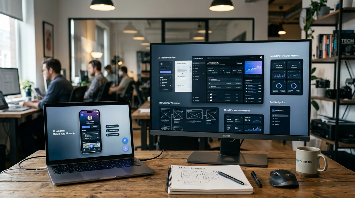
ChatGPT Images 2.0 is starting to work not just as an image generator, but as a tool for product design. A ZDNet author uploaded interfaces from two of his applications to the model and received not abstract advice, but ready-made mockups with specific improvements.
Two Products
The test was conducted by ZDNet contributor David Gewirtz. He used ChatGPT Plus for $20 per month and uploaded screenshots of two real interfaces he's working on to Images 2.0.
The first is a Mac application he's been building together with Claude Code since January 2026. The second is a landing page of a web security product. The key moment is that the model didn't just describe what it disliked, but produced new visual options that could already be discussed as design drafts.
According to the author, this changes the entire scenario of working with AI graphics. Previously, such systems mainly created "pretty pictures" and could offer a set of general interface recommendations. Now the model understands screen structure better and can suggest meaningful redesign: restructure hierarchy, highlight attention zones, and show how it all looks in the assembled form.
Ideas for Mac
The first experiment concerned a Mac application with a fairly saturated screen: large buttons on the left, a pattern grid, a detail panel, and controls partially carried over from the iPhone version. The author asked ChatGPT to "make the interface more attractive and convenient." The full version that the model returned didn't initially appeal to him: AI removed the colored buttons important for the brand and didn't fully understand the lower viewing modes. But within the mockup he found several solutions he plans to actually implement. Here are the ideas the author took for his work:
- a clearer top zone above the grid, where the screen structure is easier to read
- increased spacing between thumbnails so element selection looks cleaner
- a more successful action block in the bottom left instead of the previous iconography
- a separate favorites option that didn't exist in the app before
- a permanent Added/Updated field at the bottom of the detail panel
The main conclusion from this test isn't that AI drew a perfect interface on the first try. The value turned out to be in something different: the model acted as a quick external reviewer and compiled a package of specific ideas that the developer might not have noticed themselves. Moreover, such a mockup can already be used as a visual brief for Claude Code, so you don't have to explain the desired result only in words.
Web Design for the Task
In the second case, it was about the landing page of a security product. According to the author, its current state was neat but quite primitive — largely because he doesn't like writing CSS. Interestingly, the analysis started almost by accident here: he pasted the screenshot into ChatGPT and hit Enter before he managed to finish writing the prompt. The model itself analyzed the page and immediately pointed out the problem areas.
"The main problems are weak visual hierarchy, too much gray, a long
introductory block, and three equally loud cards below."
After this, ChatGPT suggested a more modern admin aesthetic: white cards instead of large gray panels, soft borders, more space between sections, one accent color for buttons and links, shorter lines of main text, and better contrast between headings and regular text. Then the author asked not for an analysis, but for a picture of the updated interface — and got a new mockup that could be used as the next step for work with Codex. In the generated version, AI even came up with a logo because the original screenshot didn't have one.
But what's more important is this: the model reprioritized the page differently. It highlighted separate zones for Quick Setup, Need Help, and Configure Privacy/View Docs, showing the user clear entry points. Plus it added a Site Status block at the bottom — a function the author had previously thought about but postponed due to the complexity of implementation for freemium plugins.
What This Means
For solo developers, this looks like a very practical scenario: in a few minutes, get both a UX review and a prototype that previously might have taken a team of designers and developers about a week. ChatGPT Images 2.0 doesn't fully replace a product designer and doesn't guarantee a perfect result from the first generation. But the combination of visual analysis, mockup, and subsequent task transfer to Claude Code or Codex significantly shortens the path from a raw interface to an implementable improvement.
Want to stop reading about AI and start using it?
AI News is a curated feed of AI/tech news. Hamidun Academy teaches you to use AI systematically in your work.